Designing a new digital experience for Silattuqsarvik (Nunavut Arctic College)
Role
UX Designer & Researcher
Timeline
2025 - 2026
Project Type
Higher Education, Program Discovery
Status
Design Complete, Implementation in Progress
Nunavut Arctic College operates at the intersection of education, community, and Arctic research, serving students across vast distances while supporting scientific work through the Nunavut Research Institute.
We redesigned NAC’s website to reflect this reality—shifting the experience toward program discovery and research facilitation, and creating accessible, decision-driven pathways for use in remote, culturally diverse, and bandwidth-limited contexts.
To achieve this, we focused on improving the journeys of three key user groups:
Prospective students, confidently discovering programs and understanding how to apply
Prospective researchers, clearly understanding licensing requirements, facilities, and accommodation options before committing
Website authors, easily maintaining accurate, consistent content within a frequently changing institutional environment
By clarifying key pathways and information, we reduced reliance on direct support across all journeys—freeing the small NAC team to focus on higher-value work.
The Work
1/3
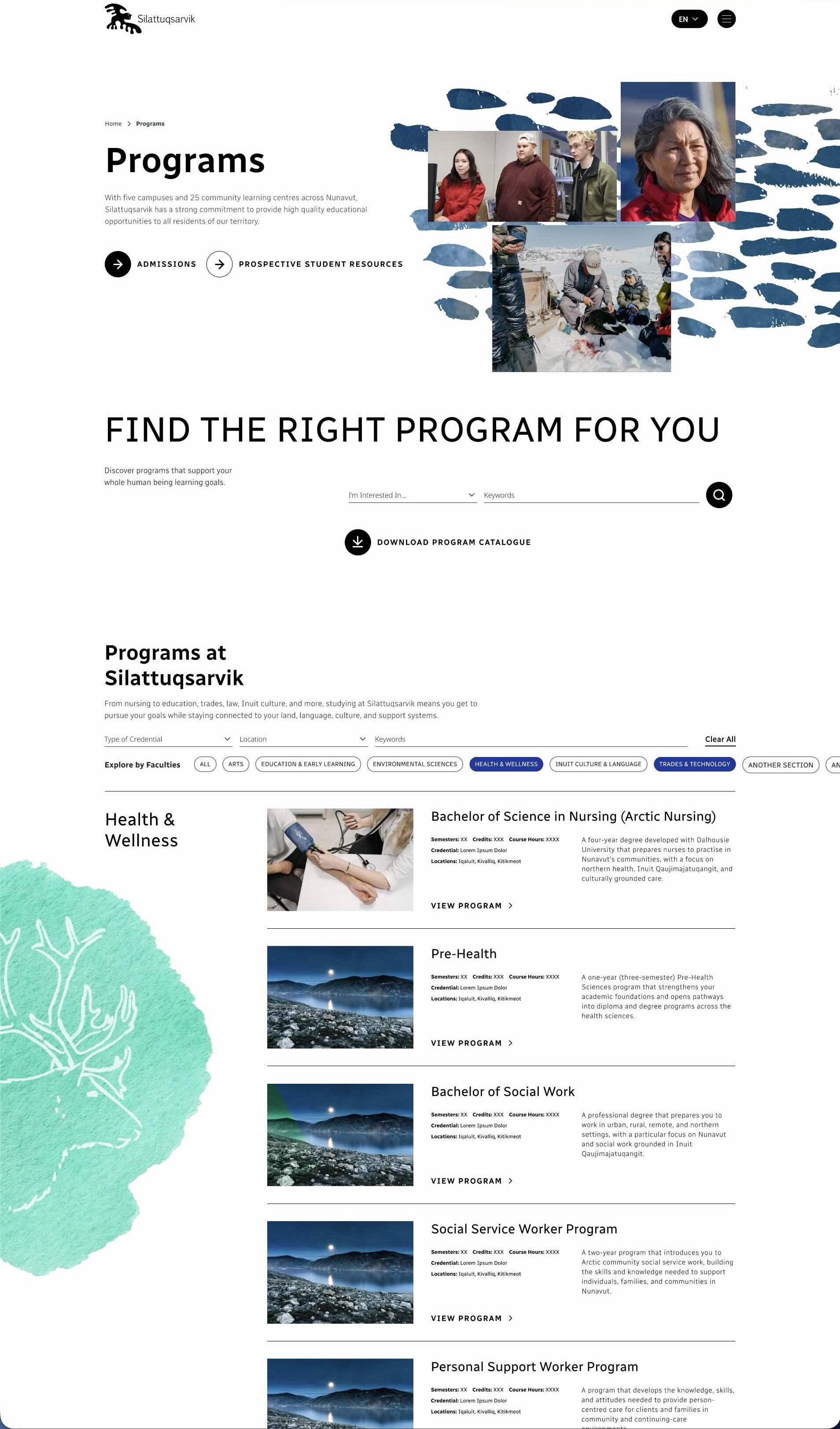
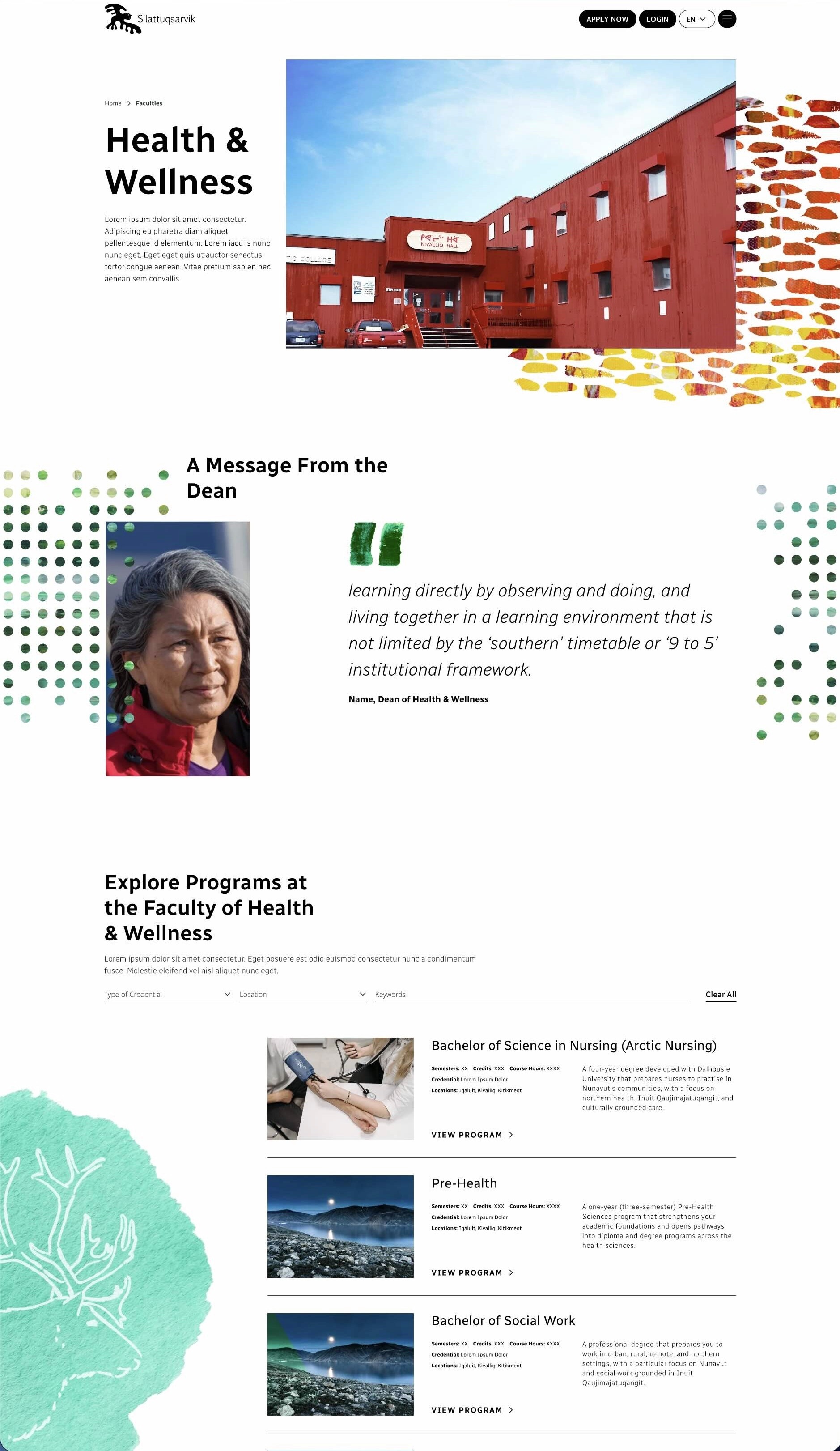
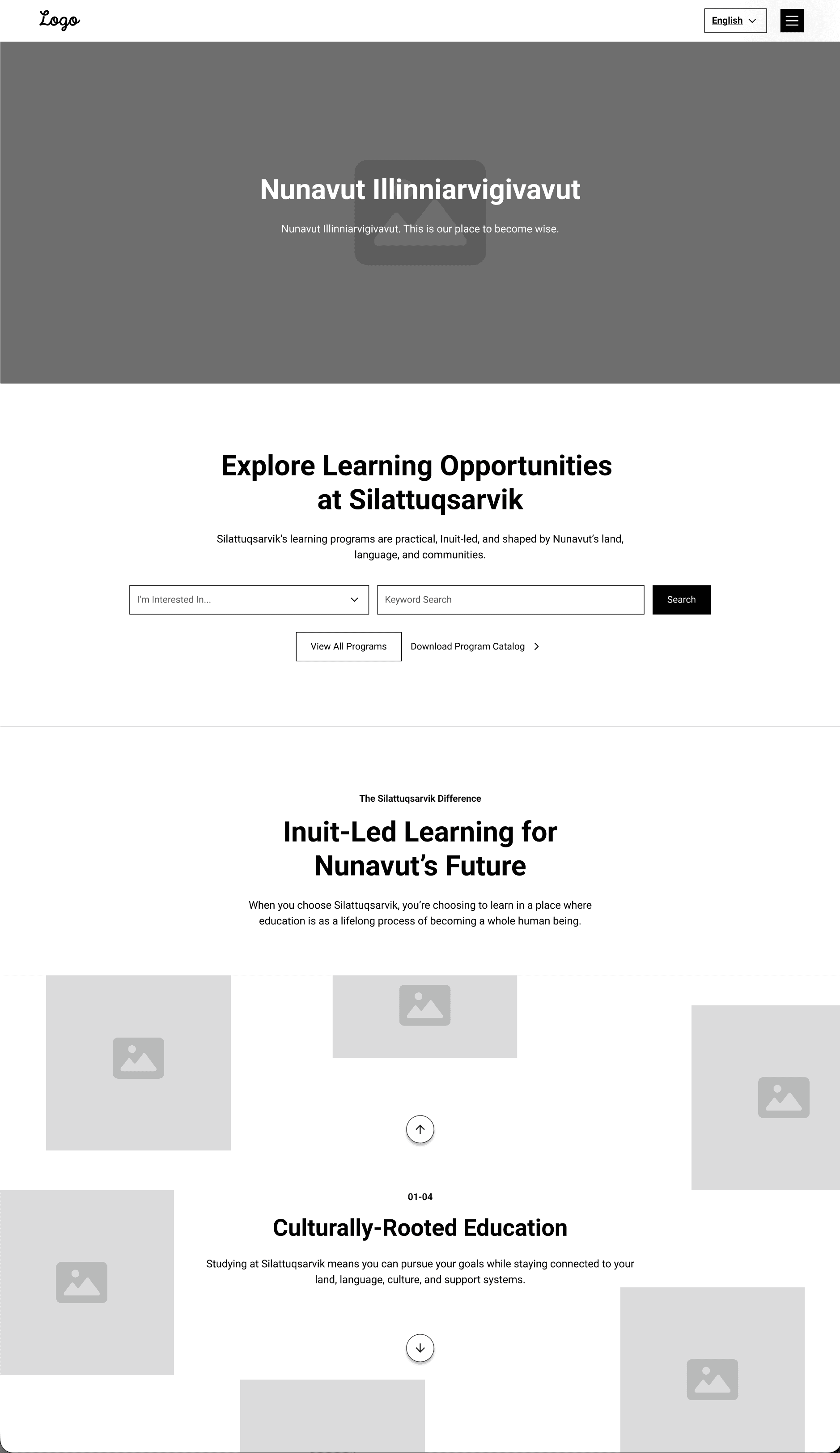
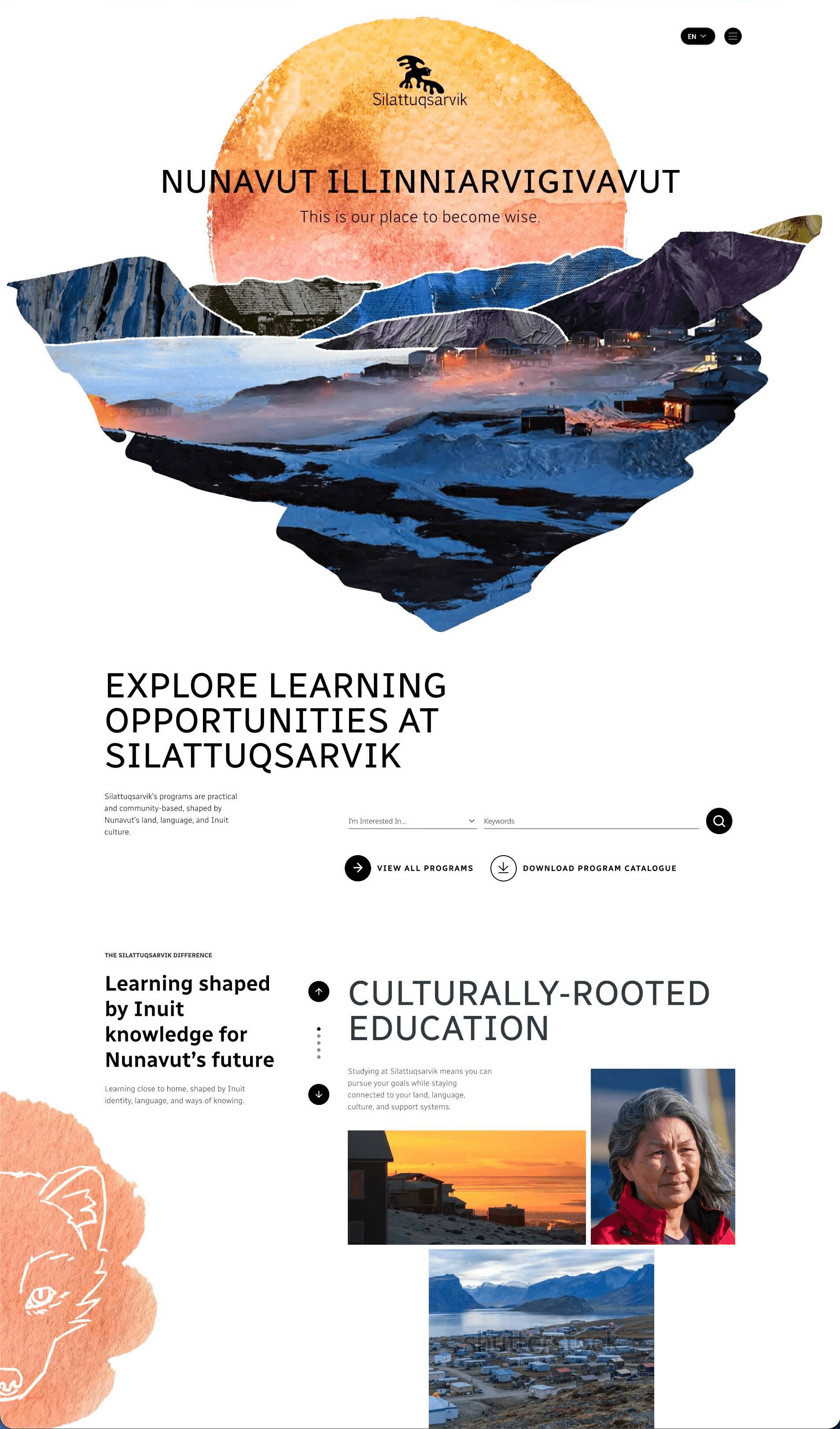
Clear Program Discovery
We redesigned the site around program discovery, helping prospective students compare options, understand requirements, and decide with confidence before applying.
We replaced scattered PDFs with structured program and faculty pages, giving students and staff a single, reliable source of truth supported by clear router-based navigation.

2/3
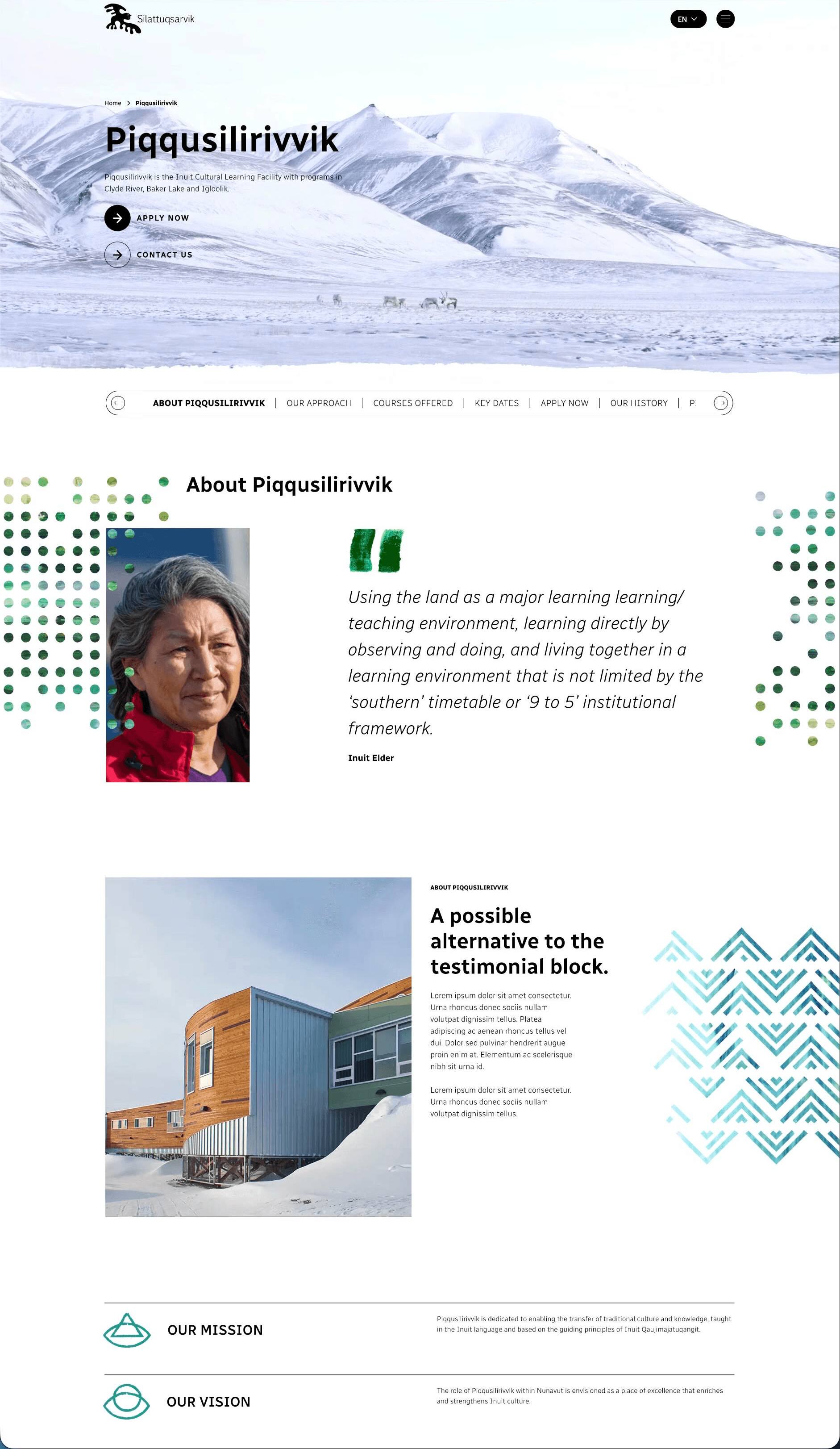
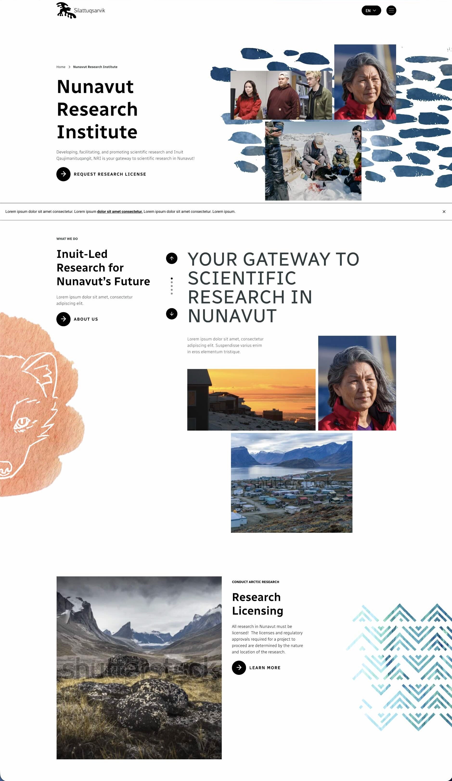
Research Grounded in Inuit Representation
I repositioned the Nunavut Research Institute as the Research and Innovation Hub, creating a clear entry point for Arctic research that centres Inuit representation and honours the principle “Nothing about us without us.”
3/3
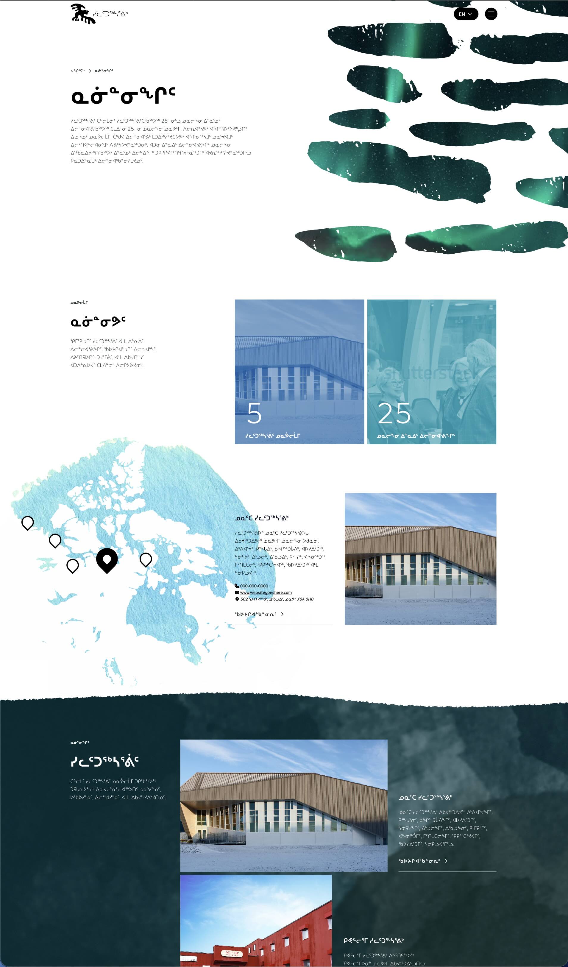
Language as a Design Driver
We built multilingual support, including Inuktitut syllabics, into the layout system—accommodating long word lengths and non-English conventions without compromising clarity.

The Process
Research & Discovery
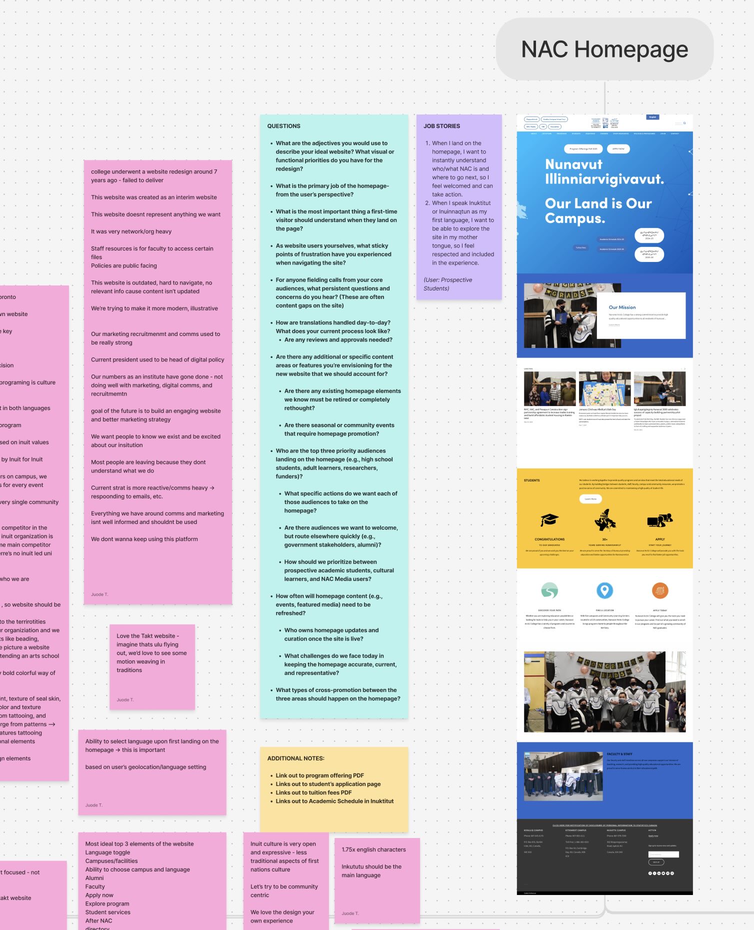
I began by reviewing the existing NAC website to identify gaps and friction, and worked closely with stakeholders through interviews and workshops to understand user needs across different user types and contexts, institutional constraints, and cultural considerations.
Solution Design
Together with the UX team, I translated these insights into a flexible design system and low-fidelity wireframes, defining clear templates, pathways, and page structures to support program discovery, research facilitation, and long-term content management.
UI & Development
Our team's UI designer translated our wireframes into high-fidelity designs. We worked closely with the development team to ensure the modules and functionality identified during research and solution design were technically feasible and ready for implementation.
The Fine Print
Context & Constraints
Nunavut Arctic College serves learners across multiple campuses and remote communities, operating within bilingual and culturally specific environments. Students vary widely in language, age, academic readiness, and confidence navigating post-secondary education. In parallel, the Nunavut Research Institute supports Arctic research through licensing, accommodation, facilities, and research records, with projects varying widely in scope and logistics. All of this is supported by a small internal team maintaining a complex site affected by frequent changes in staffing, funding, access, and language. The experience needed to reduce intimidation, clarify complex research logistics, work reliably on slow connections, and remain sustainable for non-technical content authors.
Guiding User Questions & Insights
Students and researchers consistently sought clarity and confidence before committing. Prospective students needed to understand whether a program was right for them and how to apply, while researchers struggled to locate licensing requirements, accommodation, and facility availability. Across both groups, users compared options, assessed logistics, and weighed support considerations. Internally, stakeholders lacked clear sources of truth and struggled with layouts that degraded over time due to PDF reliance and unstructured CMS use. These insights reinforced the need to support self-qualification through clear, consolidated information rather than increased staff intervention.
UX Strategy
The strategy shifted the site from fragmented information toward decision-driven pathways. Program routers, consistent templates, and question-led content helped students compare options and understand next steps, with housing, funding, and support surfaced earlier. For researchers, dedicated pages clarified licensing, facilities, accommodation, and research initiatives, supported by availability tools and access to research archives. Behind the scenes, a redesigned authoring experience consolidated content into modular, guardrailed templates, enabling consistent updates across changing institutional conditions.
Tradeoffs & Design Decisions
Several key tradeoffs shaped the final experience. While the client aspired to a visually rich, media-dense site, the primary audience accessed the site on mobile devices and often with limited bandwidth. We prioritised clarity, performance, and graceful degradation over heavy media to ensure core journeys remained accessible and reliable. Another tradeoff involved balancing familiarity with improvement. Many users were accustomed to accessing information through downloadable PDFs on the previous site. Rather than removing this behaviour entirely, we retained clear access to PDFs where appropriate, while positioning structured web pages as the primary source of truth. This allowed returning users to orient themselves quickly while encouraging a gradual shift toward more maintainable, up-to-date content.
Collaborative Workshops
Design decisions were shaped and validated through workshops with students, faculty, administration, and communications teams. These sessions surfaced how people actually choose programs, where support gaps existed across student and researcher journeys, and how institutional language and cultural context influence decision-making. This ensured the redesign aligned with NAC’s mission and Inuit values.
Key Pages
Program pages were rebuilt as standardised decision tools covering eligibility, delivery, location, application steps, prerequisites, duration, housing, support, and outcomes. A central programs router, campus pages, and Community Learning Centre templates provided geographic context and improved wayfinding. For researchers, the Research and Innovation Hub brought licensing, facilities, accommodation, partnerships, current projects, and the Isirvik Research Portal into a single, coherent experience. All layouts were designed to support English and Inuktitut content, accommodating longer translations without sacrificing readability.
Reflection
This project strengthened my ability to:
Model complex educational pathways
Design for cultural context
Simplify intimidating decisions
Structure academic and logistical information
Work across multi-audience platforms
Prioritise comprehension over conversion
Design for languages using syllabics and non-English conventions
Key takeaway: In education, clarity is often more valuable than persuasion. These journeys were not conversion funnels, they were access and confidence funnels.
Project Credits
My Contributions
Wireframing and High-Fidelity Prototyping
UX research
Information architecture
Design system establishment
Pathway mapping
User decision modelling
Content strategy
Team
Juode AlTaher - UX Team Lead
Kay Drobot - UI Designer
Steven Martz - Creative Director
Jarret McKee - Copywriter
Ryan Aceman - Director of Brand Strategy
Cormac Smith - Project Manager
Lucy Gregory - Director of Project Management
Image Copyright Nunavut Arctic College 2026.